CONTEXT
PROBLEM
APPROACH


Improve the front-end of our built-in client locations map to modern HTML, CSS & Javascript standards
An internal stakeholder approached me with a request to create a new module within our application that would essentially duplicate an existing UI but altered to show slightly different data. To satisfy the requirements, I instead proposed enhancements to the existing screens fields and filters to avoid polluting our menu with a new selection or our codebase with redundant markup.
I was mistakenly assigned this project (as the designer) because the feature involves graphics; however, the requested enhancements would require me to develop proficiency in Javascript programming and I welcomed the opportunity.
Problem
The assignment
We were asked to add a prospective client map to our application
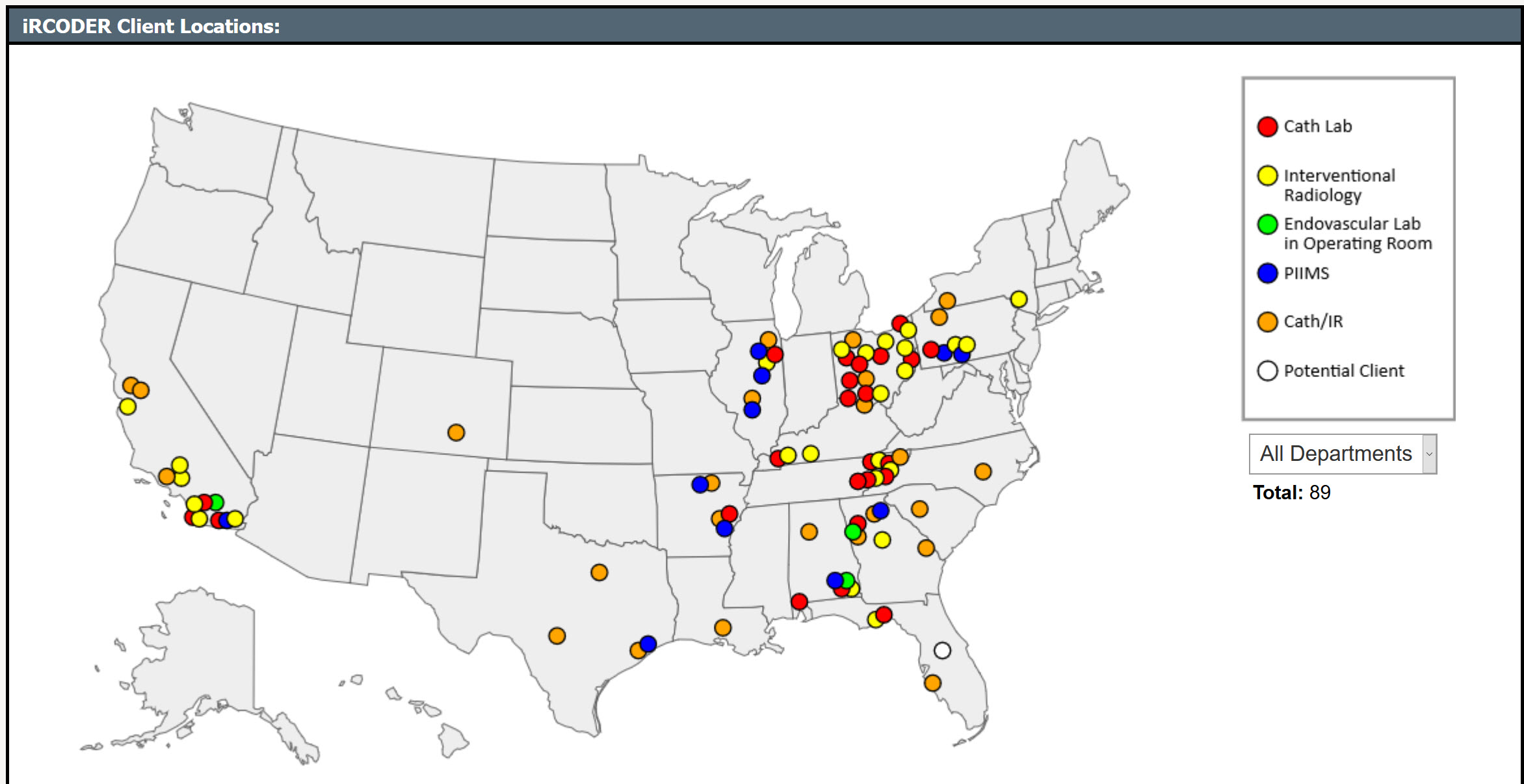
Our application features a screen where internal users can view our existing client base on a map of the US. A member of sales management requested that we also add a “Prospective Clients Map” in the menu adjacent to the existing client map, essentially duplicating the existing screen.
The reasons
We needed to keep sensitive contract information hidden while doing demos
The Sales team used the Active Clients Map during demos for social proof, showcasing the locations of our clientele throughout the country. However, this map also inadvertently displayed sensitive information about other Prospective Clients, which we did not want to reveal to a prospect during the demo.
He wanted to capture loads of new fields
This feature was intended to track prospects more effectively. Gary proposed adding numerous structured fields specifically for prospect data, transforming the application to function more like a sales CRM. These fields were unrelated to other app functionalities, indicating a need for a carefully considered approach to avoid overloading the system with irrelevant features.
The real issue
Isolating the root cause from the proposed cure
After discovery interviews with the stakeholder, what he truly needed to achieve was a way to filter information on the map and the ability to control who sees it. I assessed the current Client Locations map to understand its limitations in differentiating between customers and potential clients.
MVP
⇪ Back to Top | ⇦ Previous | Next ⇨
The main use case is keeping prospects from seeing our notes about other prospects' contracts when we’re showing off our map of active customers. The proposed minimum viable spec satisfies the request’s need directly without inflating the scope.
Suggested scope
I leveraged our existing system features to efficiently create new views, avoiding unnecessary duplication of effort. Utilizing the existing client map would avoid additional development costs and preserve menu space.
- The entity of a prospect already exists in the code, but many of the fields captured for customers do not apply.
- The ability to filter entries by customer type and show results on the map already exists, so we can use this existing function to batch customers and prospects under a UI, such as a tab.
- With distinct screens (tab) for each category, fields can be shown/hidden depending on the need.
We can enhance the existing map filters
The ability to filter entries by customer type and show results on the existing Client Locations map already exists, so we can use this existing function to batch customers and prospects under a UI, such as a tab.
In Client Locations, add an “All Active” option to the existing Departments filter that shows all Department types exclusing Potential Clients, and show this view by default on page load.
One of the existing “departments” is Potential Client. In the future, we may want to separate this more appropriately (e.g., department type, active/potential, iRCODER/PIIMS), but for a minimum viable first iteration, we can leverage the existing departments and filtering system to put these safeguards in place.
We discussed renaming the filter options "All Departments" and "Active Clients" to “All Active + Potential” and “All Active", with All Active the default selection on page load. These guardrails would hide sensitive data by default during demos; the user would have to explicitly change the filter to include Potential Clients.
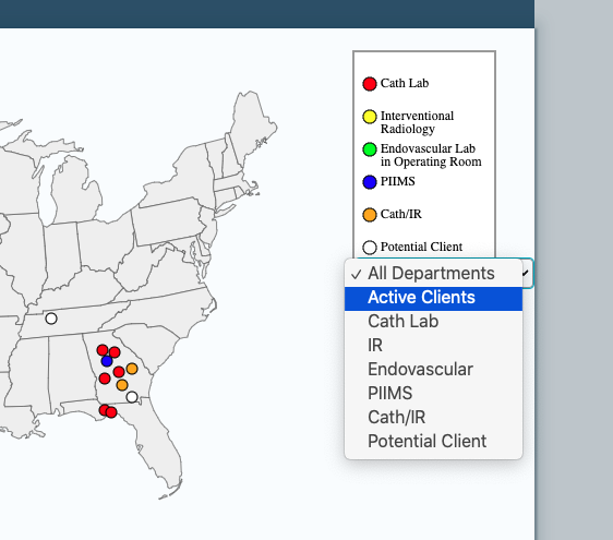
<select> combined All "Departments," Active Clients and Potential Clients into non-intuitive groupingsWe would allow more characters in the Description field...
Increasing the size of the existing Description free text field provided an interim solution, reducing immediate development costs and preventing Sales from repurposing the application with CRM-like functionalities.
...and later integrate a headless CMS
Given that the primary goal was to protect prospect information during demos, integrating with an external CRM system was planned as a secondary phase. The new requested fields could be managed in a headless CMS, to which we could either provide a link or integrate via API if available.
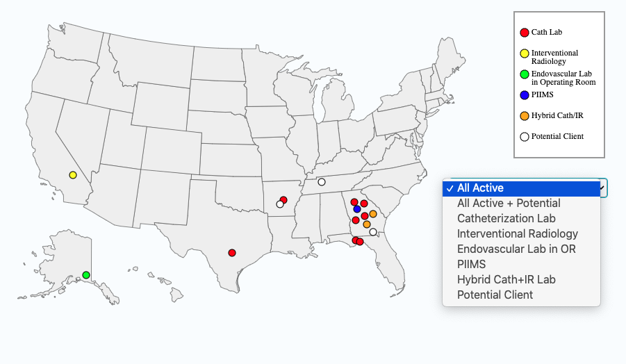
In the future, we still wanted to separate these attributes appropriately (e.g., department type, active/potential, iRCODER/PIIMS), but the MVP satisfies the immediate need, adding friction that spares the user from embarassment during their normal workflow.
Redesign
⇪ Back to Top | ⇦ Previous | Next ⇨
In a dedicated UI branch separate from data concerns, I created design concepts with improved UI/UX design for an iteration of the client locations map.
Redesigning for clarity and accuracy
I proposed reorganizing account statuses and department types to more accurately represent our data.
Making the interface more intuitive
I enhanced the user interface by repositioning filters, tooltips, and alerts for a more intuitive user experience.
Streamlining location details and user interactions
I improved how users interact with location markers and details, making the process simpler and more informative.
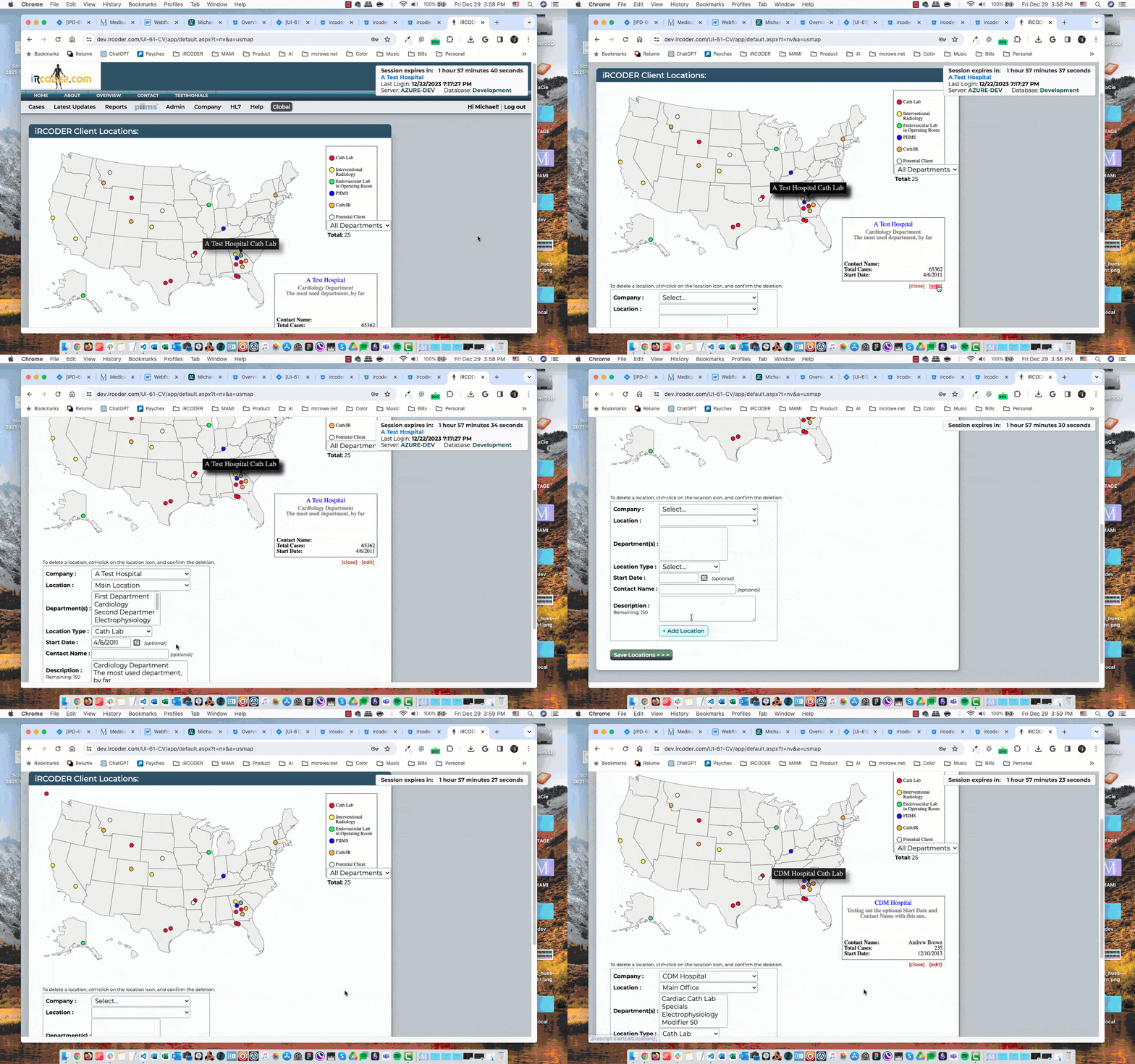
The Client Locations map is artificially produced by a user who manually inputs locations of iRCODER/PIIMS clients.
Recommend Account Status (active, potential) as a separate field from Department Type (cath lab, IR, Endo/OR) so combinations can be represented (e.g., “active cath lab,” “potential hybrid lab”). PIIMS as a department type is another question, because you can have a prospective cath lab looking at iRCoder or PIIMS.
Then we could add Status filters to the existing Type filters and set Status to Active by default.

Because the “info card” when a dot is selected is rendered as part of the <canvas> instead of displayed as text, a future phase should move it to a DOM-accessible text region that can be styled and controlled by the front end.
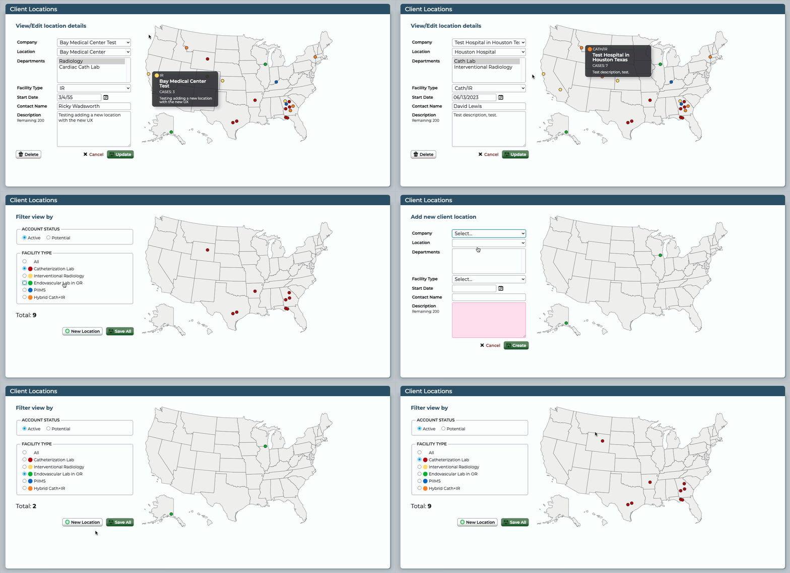
User interface designs
This update will focus on the UI changes that are specific to separating the “Active/Potential” client data point from “Facility Type.”
- Applied consistent CSS styling to location details panel
- Consolidated legend and department filter into a radio group that serves as the legend
- Added Account Status radio group and moved existing Potential Client markers there
- Moved filters before (to the left of) the results; this also allows tooltips to bleed off the right of the map without having to calculate adjustments
- Moved company information on hover from a static panel to each dot’s tooltip contents
- Moved alerts under the filters so they do not cause screen reflow of the map
- Replaced Ctrl/Cmd+click instructions to delete a location marker with a simple button
- Deleted the intermediate “Cancel/Edit” step between clicking a location and accessing its fields
- The filter view and location details are mutually exclusive and now share the space to the left of the map, depending on which function is active.
adf
Future scope
Next steps in UX improvement
Based on subject matter expert (SME) and QA feedback, I recommended user experience improvements and marked them for a future iteration, such as removing the intermediate step between clicking a dot and entering field details.
- Adding a location is confusing, with no visual cues as to where the dot is placed nor confirmation that the dot is the location just entered.
- There should not need to be two layers of Save. Coordinates can be considered location information along with all the other data points and wrapped into a single save.
- When a marker is selected, hovering another marker unsets Edit mode. This was by design to prevent conflicts between the tooltip for the new location showing with the fields for the old selected location persisting.
- When a location’s fields are Updated, they do not reflect in the tooltip until the user Saves All. This is because tooltip content pulls directly from the information in the database, which does not reflect new data until it is pushed. Address this as part of “two layers of Save.”
- When the Description field max characters are reached, the field’s default behavior is overridden to prevent new additions. However, this affects typing anywhere in the field, meaning a user cannot Select All and begin typing to overwrite. He is forced to press Delete/Backspace.
Solving data entry challenges
Changes to the data table where Active/Potential data points are captured also requires a back-end developer.
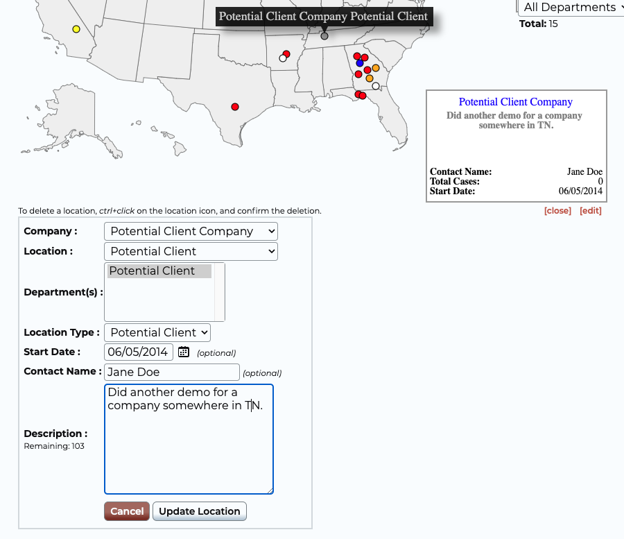
- Right now, “Potential” is still just pulling from the existing “Potential Client” types. The UI changes are a placeholder that can accommodate the new data points when they are developed.
Refactoring Javascript
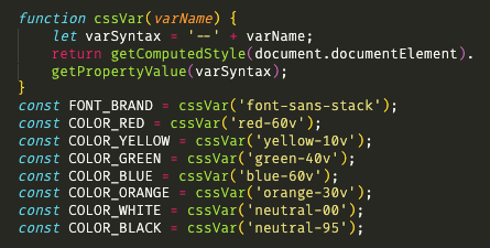
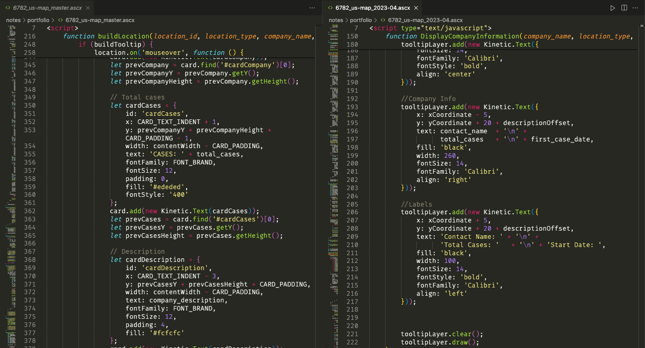
As a designer who works heavily with HTML & CSS, this was my first assignment that focused primarily on Javascript. Borrowing from principles of consistency in UI design, I recommended defining several constants as de facto design tokens, enforcing consistency and reusability.
