CONTEXT
PROBLEM
APPROACH


After working on mainly desktop apps and web sites most of my career, I took a course in native mobile UI design to keep my skills diverse and sharp.
I enrolled in a UI certification course to expand my interest in product design to a wider variety, commit to a disciplined curriculum, and have something to show prospective employers. The products I have worked on over the last decade have been legacy enterprise web apps for desktop within the healthcare niche. I felt I needed to be exposed to mobile design and other industries.
The final lesson of the Intro course asked us to propose corrections and improvements, based on what we learned about design principles, to the UI we had been building over several lessons.
Welcome page
Splash
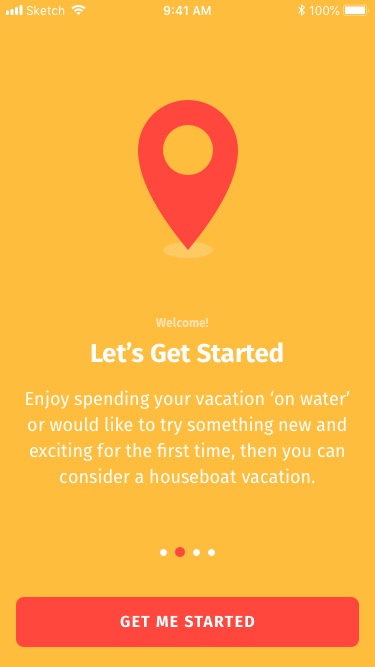
- The style is left-aligned on page 4, but an unsaved center-aligned variation appears here. I created separate styles.
- Just as the UI uses #111111 or #222222 for black, pure white (#FFFFFF) can result in "jarring" too-high contrast. I've opted for a muted white at #F0F0F0.
- Sentence case is easier to read and more inviting than title case, especially when "Let's get started" isn't a title at all.
- The subdued text "Welcome" doesn't add much to the context. It's redundant and can be removed. Now we can increase the size of "Let's get started."
- I added a subtle text shadow on heading styles to help contrast with yellow.
- I often used semibold so that I could preserve bold for emphasis, rather than just reinforce style hierarchy.
- An accelerator to skip a bloated onboarding process should be available for advanced users.
Color
Poor color contrast
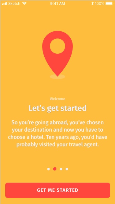
In Sketch and on my device, white text against a yellow background is horribly illegible. I knew this combination was going to fail contrast tests for accessibility.
The Web Content Accessibility Guidelines (WCAG) recommend a minimum 3:1 ratio for the relative luminance of foreground vs. background color for large text and 4.5:1 for smaller body copy. I tried changing the background to the other approved brand colors provided in the project brief. Blue (#0074CD) gave the highest contrast rating of 4.21, but still short of the 4.5 needed.

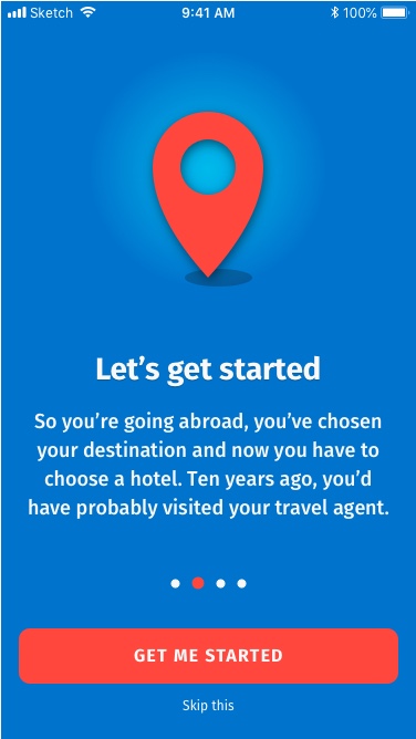
Earlier, I had arbitrarily set my toned "white" to #F0F0F0. By slowly raising its luminance, I found that #F8F8F8 provides a contrast ratio of 4.51 against brand blue. I changed my color variable in Sketch for white to this new value.
Saturated colors clashing

- Of the four provided brand colors, yellow and red work well together. However, changing the background to blue creates a visual clash with the red location icon.
- To start, the white shadow is strange. Shadows are dark. The shape should be changed to a shade of black.
- Departing from flat design, adding depth to the icon may help it settle more naturally into the new blue background. I added a drop shadow to the icon.
- I added a 50% transparent white ellipse behind the icon with a radial gradient to help reinforce contrast between red and blue. This gives the illusion of a light source and depth.
- With the x-offset on the drop shadow implying the position of the light source, I elongated and offset the icon shadow to further reinforce the illusion of depth.
Home pages
⇪ Back to Top | ⇦ Previous | Next ⇨
Login
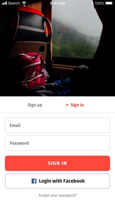
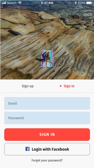
- I used semibold for the switcher component to reinforce hierarchy, because I felt it was on secondary importance to the call-to-action buttons ("SIGN IN," "Login with Facebook").
- The secondary button ("Login with Facebook") contains an icon with text. This is a common pattern that may be reused. I grouped the icon and text together so that the pair can be centered and different icons can be swapped out as a Symbol override.
- There is not enough distinction between an input field and the secondary ("Login with Facebook") button. After changing white from #F0F0F0 to #F8F8F8 across the app, I lightened the opacity of placeholder text, shaded with 20% blue, removed outlines, and gave fields and buttons different rounded corner radii.
- Tertiary call-to-action text looks too subdued on my screen. I increased the font weight from light to regular.
Destinations
- Semibold reinforces that the switcher component is subordinate to the page title, which uses bold.
- I used semibold for h2 ("Laos," "Caribbean," ...) instead of bold, because the words appear large enough to be legible at a more modest weight.
- I added a black-60% linear gradient to the bottom of each card to give the white text better contrast against the vivid images.
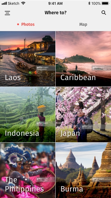
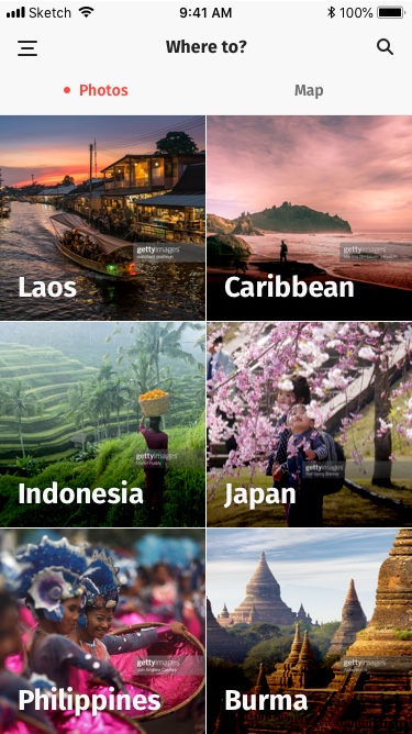
- Checking the changes on my phone screen, the contrast appears worse. I changed the h2 style back from semibold to bold and increased the opacity and size of the black linear gradient behind the text.
- Dropping The from "The Philippines" brings visual balance by fitting all accompanying text to a single line.
Content pages
⇪ Back to Top | ⇦ Previous | Next ⇨
Destination article

- To match the change from the Welcome page for better contrast, the yellow background has been changed to blue.
- I had already added a subtle text shadow to the h1 style and increased its size. This looks excellent against blue on my phone screen.
- The lede style is left-aligned here, but a center-aligned variation appears on page 1. I created separate styles.
- I added a drop-shadow to the floating button as an affordance that it is an interactive element.
- With the background changed to blue, the subdued icons are not clearly discernable as a shade of black. I changed these to white.
- I used semibold for h3 ("Related articles") and h5 ("New Maison Margiela...") because bold was distracting. I felt that the related articles were of lower importance.
- Sentence case is easier to read and more inviting than title case.
- The numbered bullets are different colors for no clear reason. Although green is approved for use, there seems little sense in introducing a new color, especially when green could be better reserved for utility alerts. I opt to stick with blue.
- The comments look too similar to the article content. They should be formatted in a way that more obviously sets them apart from the content. I reduced the font size and created a frame shaded in gray.
- Since blue is prevalent, I changed the bookmark color to a bold red. Red functions as an accent color in this UI.

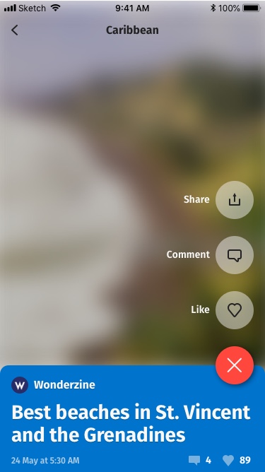
Open menu
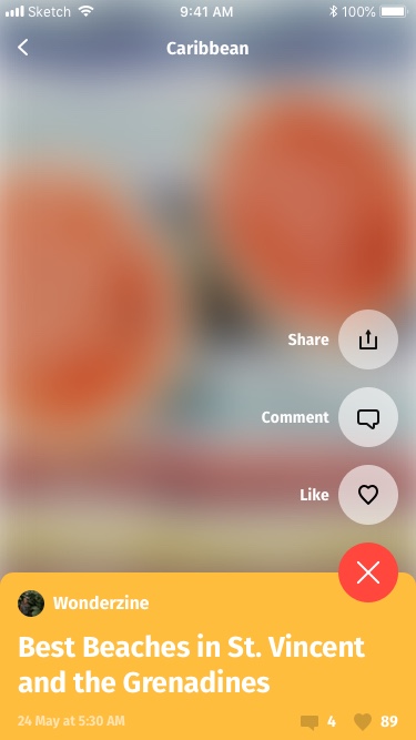
- When the time comes to design micro-interactions, there is an opportunity to animate the "plus" rotating into an "X," which is a cute trick commonly seen in today's UI trends.
- To reduce opportunity for error, I increased the vertical space between these menu options.
- When localizing the UI for use on an Android device, change the Share icon to the "three connected dots" image standard on those devices.
Verdict
Final review
In February 2021, I completed the introductory unit of the full certification course. I built my Prototype in Invision and delivered it to my mentor with my redesign notes. At this time, for the sake of time and tuition, I had to put lessons on hold to focus on my work with Above The Rest Cabins. This is my mentor's review of my final assignment:
